
Providing valuable insights to Marketing teams with AppsFlyer
Introduction
Mobile marketing teams use countless tools for user acquisition and campaign optimization.
In an ever growing industry, data is a key ingredient in keeping
in line with the goals set.
With so many tools out there providing specific information each, the marketing person is required to spend a lot of time gathering bits and pieces of data from different platforms, combining them all in spreadsheets and other workarounds.
The Solution
AppsFlyer allows Mobile Marketing teams to Attribute every app install to the marketing campaign and media source that drove it.
Granular dashboards report to the user which network or channel, ad type, ad group, and ad creative drove each user.
My Role
UX/UI Designer.
Tools used
-
Illustrator CC (Wireframes)
-
Photoshop CC (Mockups)
-
Invision (Prototyping)
-
Jira
-
Slack

Final outcome. The new dashboard and design implementation cross-system.
Research
Given information
-
The Eco-system in which the company operates is moving very fast, and very competitively, so the UX/UI design process needed to be very agile and lean.
-
The product was live and used globally, so we had a lot of users' feedbacks to work with.
-
The look and feel of the platform, and ease of use should be aligned with current trends, but stay minimal for complex functionalities.
Research methodologies
-
Team members interviews, Mainly support and CSMs who most frequently interact with the end-users.
-
Competitive research.
-
References research - specifically dashboard functionality, filter functionality, and data visualization.
-
Personas creation process - Lean personas (aka proto-personas).

User flows and content hierarchy
Together with the team members (including product managers, developers, and CTO), we tried to define what is the story the dashboard can tell the users.
We wanted to make sure we have high-level data points to help raise flags if something is not as expected.
It was also very important to allow a very intuitive and usable drill-down functionality, so if the users see something they are interested in finding more about, with a single click they could drill down and get a more extensive data.

User Behavior analysis
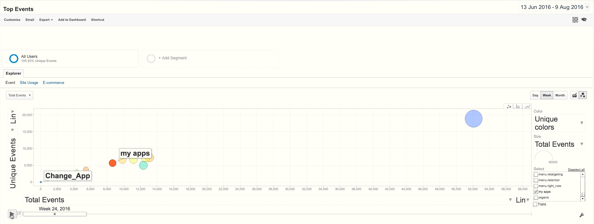
I'm a true believer of data-based decision making, alongside qualitative research. In this project, it was very important for me to embed and analyze the users' behavior on the platform. I've used the Google Analytics tool, to track page impressions and usage, define events syntax, and create reports for the team.
For example, we found that users aren't using the sidebar dropdown to switch between different apps they own. As a solution, we added and highlighted the words "Search App".

After publishing the change, we started tracking users' behavior
and comparing the newly added functionality to change apps,
and the old button. The results showed a massive usage shift
from the current button, to the new functionality.
Product insights research
After launching the new dashboard for users to work with, the next step was to understand where in the system we can improve
the experience for the users.
Gathering enough data to start making assumptions takes time,
so alongside embedding the analytics syntax in the platform,
I conducted an internal survey.
The participants, mainly team members from the Success management and support teams, were asked to review (individually) the platform's pages and point out one single issue they are being repeatedly asked about.
After gathering all the answers, I prepared a report in which we prioritized our next goals and tasks to improve the user experience
cross-platform.

Product Style guide alignment
The system required a single style guide to create cross-platform consistency, both on the visual aspect and the behavioral aspect of the different components.
This was the first stepping stone on the way to start creating a design system for the product and all its features.
I've defined a style guide for the FE developers to work with, and we used it as a guideline in re-designing the existing features on the platform to fit the Dashboard's look and feel.

Reflection
Zoom in - Zoom out, Lead, Communicate
-
Working on a new product requires a deep understanding of the product itself,
-
but also the eco-system in which it operates, and the company's objectives.
-
Leading the process from the UX perspective is sometimes a key element to a successful project such as this. It helped align everyone on the team to the same objectives and tasks at hand and helped in prioritizing what's next.
-
Good communication skills are an essential tool for the successful process and collaboration with all the relevant parties.


Other projects

Back End system
for B2B

Onboarding process product management

Complex configuration system